
To measure success, we looked at user engagement measured by feedback from the community and site traffic. The response from the community was overwhelmingly positive and in a timespan of 3 months, traffic rose from 250,000 page views per month to over 800,000.
Overview
uTest is a company that connects your apps, websites, IoT products and in-store experiences with the world’s largest community of digital experience quality experts. uTest already had a marketing website, but they were looking to create a separate, online community for their testing experts. They wanted to create a social platform that was very informative, but also one that users enjoyed coming back to for the relationships. These testers live around the world and it's not often they are able to meet up face to face. This platform would give them an opportunity to share ideas, best practices, learn, and have fun.
The Process
The first objective was to nail down the scope. We knew it would contain areas for the testers to post questions, discover tools, take video courses, and read blog posts. These features would help provide lots of great content, but not necessarily keep the users coming back every day. After brainstorming a bit more, we ended up adding a few more features that made it feel more like a social media site. At the end of the day, users could view paid projects, "follow" other users, write their own blog content, share status updates, and leave comments all while earning points to receive badges. And of course, there was a leaderboard, for who had the most points.
Prototype and User Feedback
At one point in the process, we were unsure of what type of experience a user would prefer for the homepage. (Curated links to new content vs. Feed of users they follow) We also wanted to test a new idea that would allow users to save content to a ToDo list. We quickly prototyped the two ideas and sent them out to our users for feedback. Below is Option A, which was the one we ultimately decided to move forward with.
Navigation
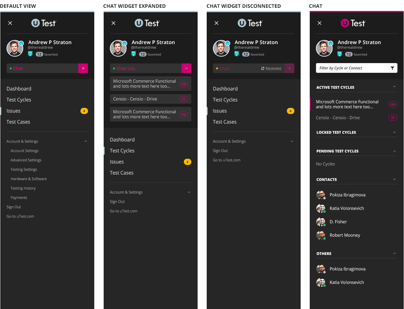
As the project progressed, someone mentioned that some of our testers might also be logging into other platforms (Chat and Bug Tracking) and that it would be great to have a unified navigation. This would be a bit of an undertaking, but we had to agree. We moved everything over to a left hand nav and I think the end result turned out really nice.

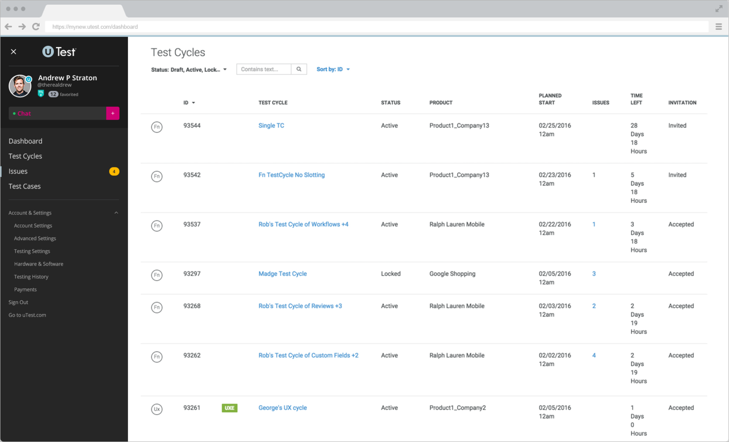
User Interface
For the final UI, we went with a very clean and open look. The app was robust and we didn't want users feeling overwhelmed when they first arrived. Using a simple, but playful font helped as well.


Conclusion
To measure success, we looked at user engagement measured by feedback from the community and site traffic. The response from the community was overwhelmingly positive and in a timespan of 3 months, traffic rose from 250,000 page views per month to over 800,000.